Kickoff
We started by meeting with the HNC Living team to talk about how the organization was evolving and their goals for the logo redesign. When we talked about what wasn’t working with their logo, they shared a few key points:
- Their logo over-emphasized “HNC”
- It under-emphasized “Living”
- They felt the overall look was dated and could be mistaken as a logo for an accounting firm
- They didn't want to stray too far from their current design and color scheme
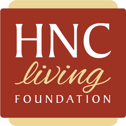
The old logo
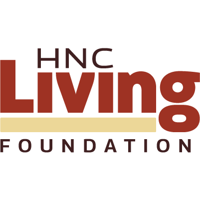
The new logo
Process: Exploration
With the input from the HNC Living team mind, we started by exploring a range of designs. We tried new font combinations and emphasized “Living” by playing with style and scale.
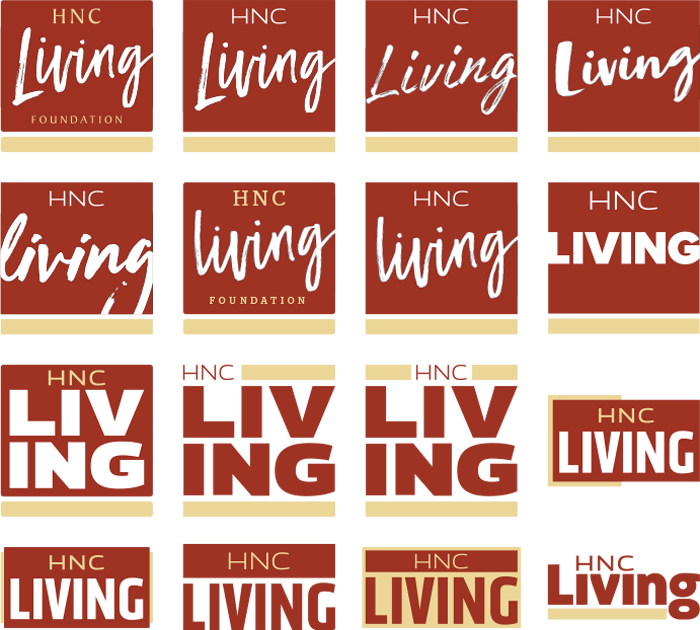
A sampling of early design explorations
Sharing Ideas
After preparing a range of designs, we presented the first round of ideas to the HNC Living team. The presentation outlined key elements of each design and placed them in a website mockup to show context. Most of the designs stayed true to their existing logo, but we included an option – ”big break“ – that served a complete break from the old design. This option proved to be the favorite.

Refining the design
After choosing the new design, we explored additional variations that reintroduced “Foundation”
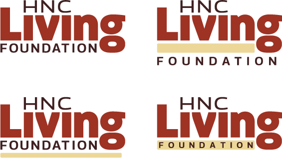
Launching the Logo
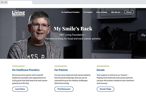
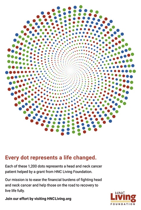
The logo was introduced in November 2018. We launched with updates to HNCLiving.org and their social profiles, a new ad layout, logo guidelines, and more.
Ad Layout
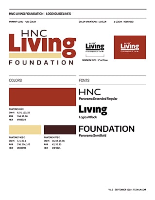
Logo Guidelines
